AurumLabel
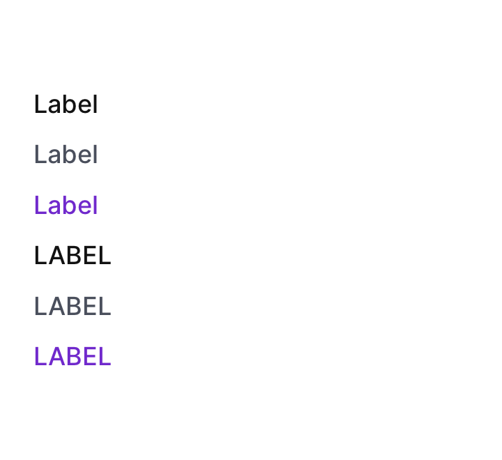
Aurum's label primitive — a small styled text element used for form field names, section titles, and metadata.
| family | Text |
|---|---|
| platform | iOS 17+ · SwiftUI |
| figma | component master ↗ |
| source | Sources/Aurum/Component/Text/AurumLabel.swift |
| code connect | FigmaConnect/Sources/AurumFigmaConnect/AurumLabel.figma.swift |
| snapshots | 3 baselines · iPhone 17 Pro · iOS 26.5 |
Aurum's label primitive — a small styled text element used for form
field names, section titles, and metadata. The SwiftUI port of
aurum-android's AurumLabel: a thin styling wrapper over AurumText.
Labels are NOT badges. Badges have a pill-shaped coloured container; labels are plain styled text with type/emphasis control and optional uppercase transformation.
Intended use
Use for short annotative text — form-field labels, helper / caption text, metadata rows. Labels read as supporting context around real content. For paragraph copy reach for AurumText with a bodyM+ style; for status pills use AurumBadge.
Do
- Pick
typefrom intent —.defaultfor neutral context,.subtlefor de-emphasised metadata,.strongwhen the label needs to stand out as a section break. - Use
isUpperCase: trueonly for short section markers ("DETAILS", "OPTIONS") — uppercase paragraphs become unreadable.
Don’t
- Use as the page or section title — those are
AurumTextwithtitle*styles orAurumSectionHeader. - Reach for
AurumLabelwhen you need a coloured pill — that'sAurumBadge.
Snapshots
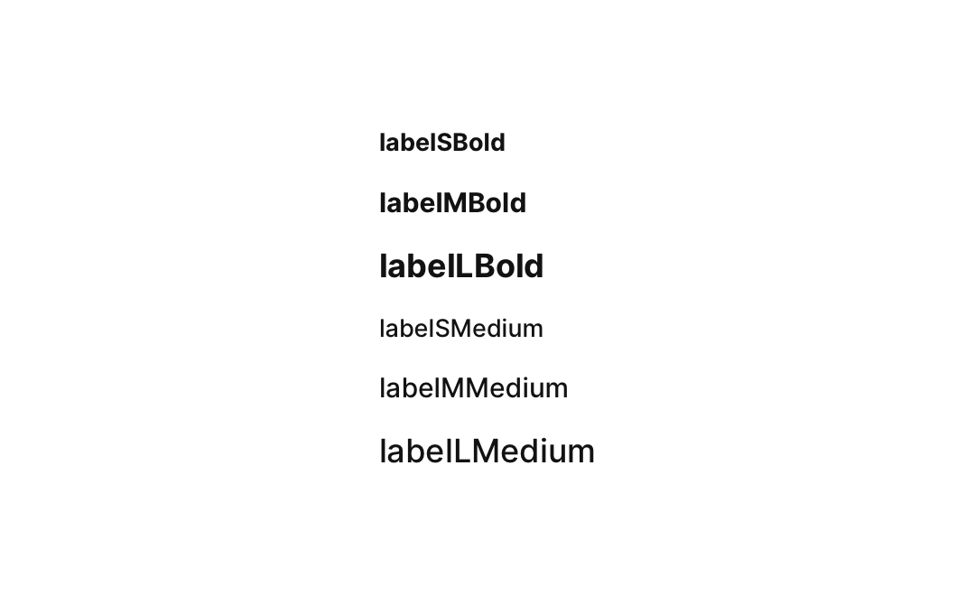
Recorded on the pinned simulator — iPhone 17 Pro · iOS 26.5 · Xcode 26.6.

Code Connect
Mapped to Figma node 3774:137816 ↗ — SwiftUI snippets appear in Dev Mode for the latest release.