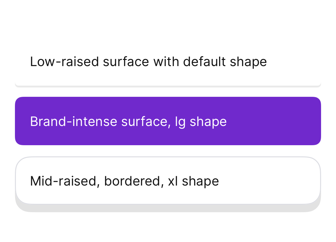
AurumSurface
Aurum's base container primitive.
| family | Surfaces |
|---|---|
| platform | iOS 17+ · SwiftUI |
| source | Sources/Aurum/Component/Surface/AurumSurface.swift |
| snapshots | 1 baselines · iPhone 17 Pro · iOS 26.5 |
Aurum's base container primitive. The SwiftUI port of aurum-android's
AurumSurface.
A themed container that applies background colour, shape clipping,
optional border, and optional elevation shadow — the building block for
cards, banners, and any other visually-distinct surface. The shadow
renders through .aurumShadow (the Figma-fidelity recipe), a step up
from Android's platform shadow.
Intended use
Use to wrap visually-distinct content blocks that need consistent token-driven styling — cards, banners, sheet contents, any container that wants Aurum's background / radius / border / elevation in one shot. For transient feedback use AurumToast.
Do
- Pick
colorfrom semantic surface tokens (bgSurfaceLowContrast/bgSurfaceMidContrast/bgSurfaceHighContrast) so contrast hierarchy stays consistent. - Pair
elevationwith a token fromAurum.elevation— never construct ad-hoc shadows. - Use
borderColor: nil(default) whenelevationis set; combining a hard border with a shadow looks crowded.
Don’t
- Hand-roll card chrome with raw
.background/.shadowin feature code — that's exactly what this primitive prevents. - Use as a transparent overlay (use a scrim) or as a full-screen background.
- Mix raw
Colors withAurum.colors.*— recolour through tokens only.
Snapshots
Recorded on the pinned simulator — iPhone 17 Pro · iOS 26.5 · Xcode 26.6.