AurumBottomSheet
Aurum's modal bottom sheet — the SwiftUI port of aurum-android's AurumBottomSheet, built on the native .sheet presentation with a self-sizing detent.
| family | Sheets |
|---|---|
| platform | iOS 17+ · SwiftUI |
| figma | component master ↗ |
| source | Sources/Aurum/Component/Sheet/AurumBottomSheet.swift |
| code connect | FigmaConnect/Sources/AurumFigmaConnect/AurumBottomSheet.figma.swift |
| snapshots | 2 baselines · iPhone 17 Pro · iOS 26.5 |
Aurum's modal bottom sheet — the SwiftUI port of aurum-android's
AurumBottomSheet, built on the native .sheet presentation with a
self-sizing detent.
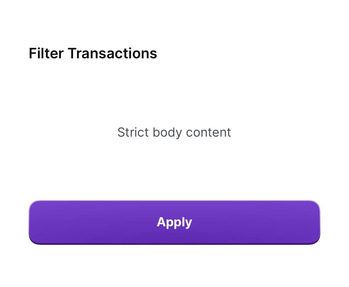
- .strict — built-in 56 pt page header (title), the caller's
content, optional sticky bottom button. Use for forms / filters /
selections. Dismissal is via drag / scrim — no top-right close button.
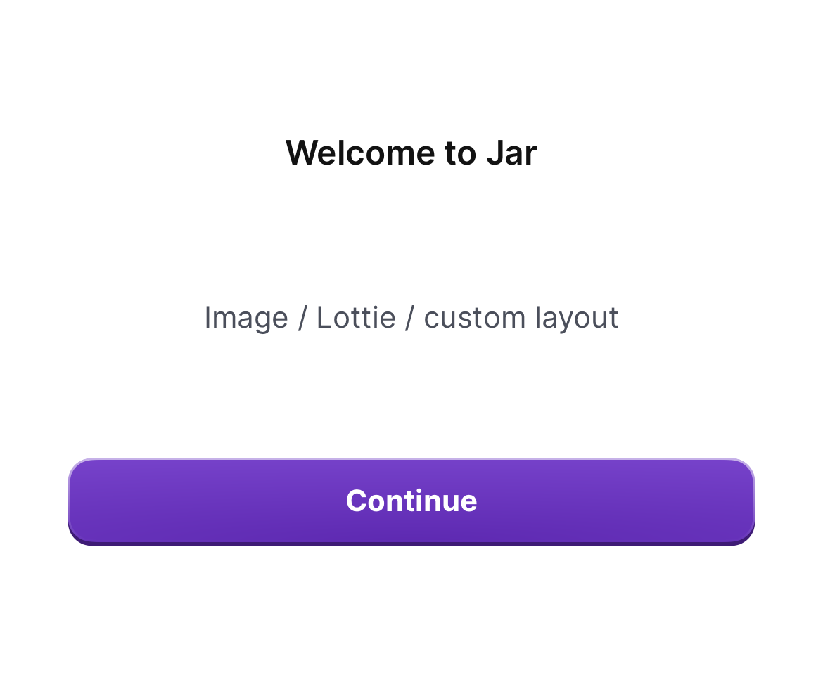
- .flexible — no header, content owns its own layout (full-bleed
images, Lottie). Use for marketing / onboarding.
Platform notes vs Android: the drag indicator is the system one, drawn inside the card per iOS convention (Android floats a white pill on the scrim above the card); the scrim is the system dim (SwiftUI sheets don't expose a scrim colour). Corner radius, card colour, header anatomy, and the sticky-button slot are token-faithful.
Present via the modifier:
.aurumBottomSheet(isPresented: $showFilters, title: "Filter Transactions") { FilterList() } primaryButton: { AurumButton("Apply", isFullWidth: true) { apply() } }
Intended use
Use as the only bottom-sheet surface in feature code. Prefer over raw .sheet so the corner radius, page header, sizing, and light forcing are consistent across the app.
Do
- Use
.strictfor any sheet hosting form inputs / lists / filters — the page header gives users a predictable anchor. - Pass
primaryButtonas anAurumButton(.mediumfor strict,.smallfor flexible). - Wrap long content in a
ScrollView— the sheet sizes to content and does not scroll on its own.
Don’t
- Use
.flexiblefor forms / inputs — strict's page header anchors the title as a stable reference. - Render a custom drag handle inside
content— the indicator is part of the contract. - Place a button inside
contentwhenprimaryButtonis the right slot — the bottom button is sticky and visually anchored.
Snapshots
Recorded on the pinned simulator — iPhone 17 Pro · iOS 26.5 · Xcode 26.6.
Code Connect
Mapped to Figma node 6002:939 ↗ — SwiftUI snippets appear in Dev Mode for the latest release.