AurumSwitch
Aurum's switch (toggle) component.
| family | Selection |
|---|---|
| platform | iOS 17+ · SwiftUI |
| figma | component master ↗ |
| source | Sources/Aurum/Component/Selection/AurumSwitch.swift |
| code connect | FigmaConnect/Sources/AurumFigmaConnect/AurumSwitch.figma.swift |
| snapshots | 1 baselines · iPhone 17 Pro · iOS 26.5 |
Aurum's switch (toggle) component. The SwiftUI port of aurum-android's
AurumSwitch (Figma node 4018:557).
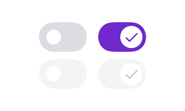
Custom-drawn to the Figma/M3 anatomy Android renders (52×32 track,
thumb that grows 16 → 24 pt with a check glyph when on) — the native
SwiftUI Toggle can't show the thumb glyph or the grow behaviour, so
wrapping it would drift from the design.
Intended use
Use for binary settings that take effect immediately — notifications on/off, biometric auth toggle. The state change is the action; there is no separate Save step. For a mutually-exclusive choice between named options use AurumRadioGroup; for form-style submit-on-confirm fields use a labelled AurumTextField or AurumChip selection.
Do
- Apply the effect synchronously when
onCheckedChangefires — no "Apply" or "Save" step. - Pair with a label and (optionally) a subtitle that names the setting clearly; never use a bare unlabelled switch.
- Reflect remote-sync failures by reverting the visual state and surfacing a transient
AurumToasterror.
Don’t
- Use a switch as a form field that requires a separate submit — users will toggle and walk away expecting it to stick.
- Wrap the native
Toggleand tint it with Aurum colours in feature code; that's exactly what this component prevents. - Use a switch to represent a 3-state setting (on / off / system-default) — switches are strictly binary.
Snapshots
Recorded on the pinned simulator — iPhone 17 Pro · iOS 26.5 · Xcode 26.6.
Code Connect
Mapped to Figma node 4018:557 ↗ — SwiftUI snippets appear in Dev Mode for the latest release.