AurumCheckbox
Aurum's checkbox — a tri-state selection control.
| family | Selection |
|---|---|
| platform | iOS 17+ · SwiftUI |
| figma | component master ↗ |
| source | Sources/Aurum/Component/Selection/AurumCheckbox.swift |
| code connect | FigmaConnect/Sources/AurumFigmaConnect/AurumCheckbox.figma.swift |
| snapshots | 1 baselines · iPhone 17 Pro · iOS 26.5 |
Aurum's checkbox — a tri-state selection control. The SwiftUI port of
aurum-android's AurumCheckbox (Figma Checkbox, node 5169:1314).
Pass label: nil to render only the box (Figma's withoutLabel
variant). Use AurumCheckboxGroup for multi-select sets; this is the
building block for one option.
Intended use
Use as the building block inside AurumCheckboxGroup for multi-select forms (filter facets, terms-acceptance, "select all that apply"). Reach for it directly only for a standalone inclusion toggle — never for binary settings that take effect immediately (use AurumSwitch) or mutually-exclusive choice (use AurumRadioGroup).
Do
- Use
.indeterminateonly on a parent box that summarises a partially-selected child group; never as a standalone "maybe" state. - Place the label
.end(default) for vertical lists; switch to.startonly inside full-width list rows where the box anchors the trailing edge. - Pair
error: truewith a feedback-negative helper line on the parent surface to communicate validation failure on required consent.
Don’t
- Use a checkbox to fire navigation actions on tap — the box represents inclusion state, not a button.
- Hand-roll an "indeterminate" by overlaying a separator over a checked box; flip
AurumCheckStateinstead so semantics are preserved. - Render multiple
AurumCheckboxes manually as a group; compose them viaAurumCheckboxGroupso the group enforces label/error layout.
Snapshots
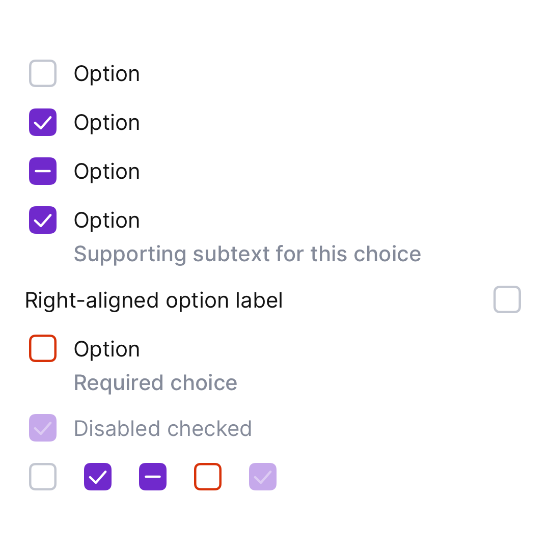
Recorded on the pinned simulator — iPhone 17 Pro · iOS 26.5 · Xcode 26.6.
Code Connect
Mapped to Figma node 5169:1314 ↗ — SwiftUI snippets appear in Dev Mode for the latest release.