AurumTabRow
Aurum's tab row — a strip of AurumTab cells with an animated selection indicator.
| family | Navigation |
|---|---|
| platform | iOS 17+ · SwiftUI |
| figma | component master ↗ |
| source | Sources/Aurum/Component/Navigation/AurumTabRow.swift |
| code connect | FigmaConnect/Sources/AurumFigmaConnect/AurumTabRow.figma.swift |
| snapshots | 1 baselines · iPhone 17 Pro · iOS 26.5 |
Aurum's tab row — a strip of AurumTab cells with an animated selection
indicator. The SwiftUI port of aurum-android's AurumTabRow (Figma
GroupRoot, node 5531:795).
Tabs are sized to max(widestNaturalTab, 100 pt). If the total fits the
viewport, tabs flex to share the full width equally — matching Figma's
two-/three-tab flex-[1_0_0] variants. If the total overflows, the row
becomes horizontally scrollable and every tab pins to the computed width
— matching Figma's four-tab fixed-100px variant and gracefully
extending to 5+ tabs. (Android probes intrinsic widths via
SubcomposeLayout; here natural widths are measured with the tab text
style's scaled font — same algorithm, platform-native probe.)
Unlike Android's slot-based tabs lambda, the row takes an items
array — SwiftUI's indicator placement and width algorithm need the tab
count and data up front.
Intended use
Use as the top-of-screen tab strip for switching between sibling sub-views of one destination (e.g. Gold / Silver / Crypto / FD on a Portfolio screen). Tabs are for in-screen navigation, not app-level navigation.
Do
- Drive
selectedTabIndexfrom hoisted screen state and routeonSelectthrough your view model so the underline animation stays in sync with the rendered sub-view. - Pass 2–6
items— fewer feels under-utilised, more crowds the strip; for 6+ destinations consider a different navigation pattern. - Trust the auto-fit-or-scroll behaviour — short labels at 2/3 tabs flex to fill the row, longer labels at 4+ tabs scroll horizontally with each tab pinned to ≥ 100 pt.
Don’t
- Wrap
AurumTabRowinside another horizontal scroller — when the row chooses scroll mode, nested horizontal scroll fights touch handling. - Set a fixed width on the row — it reads the proposed width to decide between fit and scroll modes; constraining it forces the strip into permanent scroll.
- Represent an unavailable destination as a greyed-out item — omit it from
itemsuntil it's selectable.
Snapshots
Recorded on the pinned simulator — iPhone 17 Pro · iOS 26.5 · Xcode 26.6.
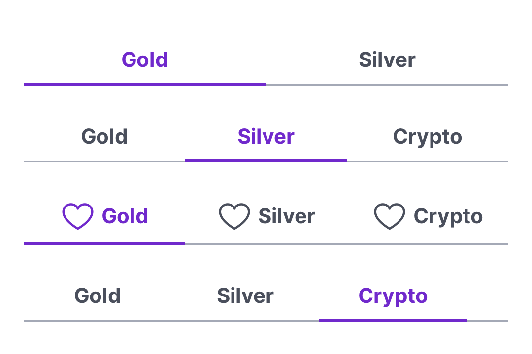
Code Connect
Mapped to Figma node 5531:795 ↗ — SwiftUI snippets appear in Dev Mode for the latest release.