AurumTab
A single tab item for use inside AurumTabRow.
| family | Navigation |
|---|---|
| platform | iOS 17+ · SwiftUI |
| figma | component master ↗ |
| source | Sources/Aurum/Component/Navigation/AurumTab.swift |
| code connect | FigmaConnect/Sources/AurumFigmaConnect/AurumTab.figma.swift |
| snapshots | 1 baselines · iPhone 17 Pro · iOS 26.5 |
A single tab item for use inside AurumTabRow. The SwiftUI port of
aurum-android's AurumTab (Figma _Tabs, node 5430:3115).
The active-indicator underline, equal-width sizing, and fit-or-scroll
behaviour are managed by AurumTabRow — outside a row this renders a
bare label cell at its natural width.
Intended use
Use as the per-tab cell of an AurumTabRow. One tab per destination, with a short label and an optional 24 pt leading icon. Outside an AurumTabRow it has no underline indicator and no equal-width sizing — always compose it through the row's items.
Do
- Hoist the selected index in your screen state and drive the row's
selectedTabIndexoff it; the underline animation tracks the row's index. - Keep labels short (≤10 chars) — Figma sizes tabs at min 100 pt; long strings either widen every tab or clip.
- Pass an icon from
AurumIcons.*— the leading slot is pinned toAurum.iconSize.xl(24 pt) per Figma.
Don’t
- Compose
AurumTaboutside anAurumTabRow— standalone tabs render at natural width with no indicator. - Mix this with a hand-rolled segmented control in the same strip — token colours, the 2 pt underline, and the equal-width algorithm only line up across
AurumTabsiblings. - Render an unavailable destination by greying out a tab — Figma has no disabled variant; omit the destination from
itemsuntil it's selectable.
Snapshots
Recorded on the pinned simulator — iPhone 17 Pro · iOS 26.5 · Xcode 26.6.
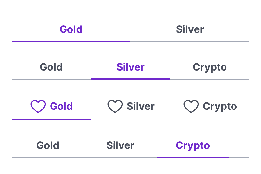
Code Connect
Mapped to Figma node 5430:3115 ↗ — SwiftUI snippets appear in Dev Mode for the latest release.