AurumSectionHeader
Aurum's section header — used to group related content within a screen.
| family | Navigation |
|---|---|
| platform | iOS 17+ · SwiftUI |
| figma | component master ↗ |
| source | Sources/Aurum/Component/Navigation/AurumSectionHeader.swift |
| code connect | FigmaConnect/Sources/AurumFigmaConnect/AurumSectionHeader.figma.swift |
| snapshots | 1 baselines · iPhone 17 Pro · iOS 26.5 |
Aurum's section header — used to group related content within a screen.
The SwiftUI port of aurum-android's AurumSectionHeader.
Layout: full width, 48 pt tall, horizontal padding s5; left group is
title (+ optional subtitle), right group is the optional action.
Intended use
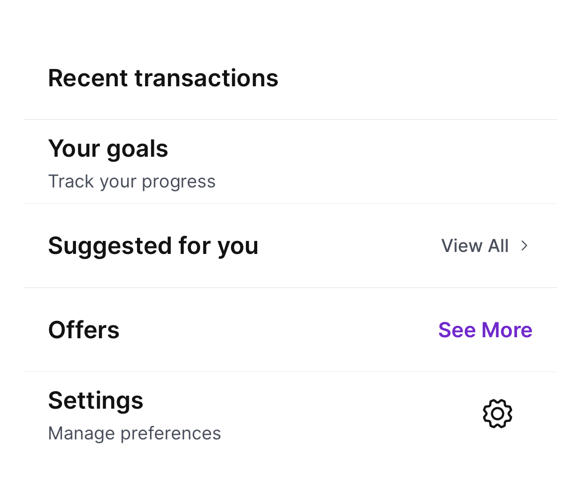
Use as the H2-style break between groups of related content within a scrollable surface — "Recent transactions", "Your goals", "Suggested for you". The optional right-aligned action lets a section advertise its own deeper view. For thin row separators use AurumDivider.
Do
- Use the
.linkaction for "View All / See More" navigation actions — the chevron signals "drill in". - Keep the title to one line and let ellipsis truncate overflow — section headers should be scannable.
- Pair
subtitlewith the title for sections whose name alone isn't self-explanatory (e.g. "Goals" + "Track your progress").
Don’t
- Use as a page-level header — section headers are intra-screen.
- Stack multiple action types on one header — pick one of
.link/.text/.icon. - Use the
.textaction for navigation when.linkis also fitting — the chevron tells users they're entering a new surface.
Snapshots
Recorded on the pinned simulator — iPhone 17 Pro · iOS 26.5 · Xcode 26.6.
Code Connect
Mapped to Figma node 3702:162190 ↗ — SwiftUI snippets appear in Dev Mode for the latest release.