AurumPageHeader
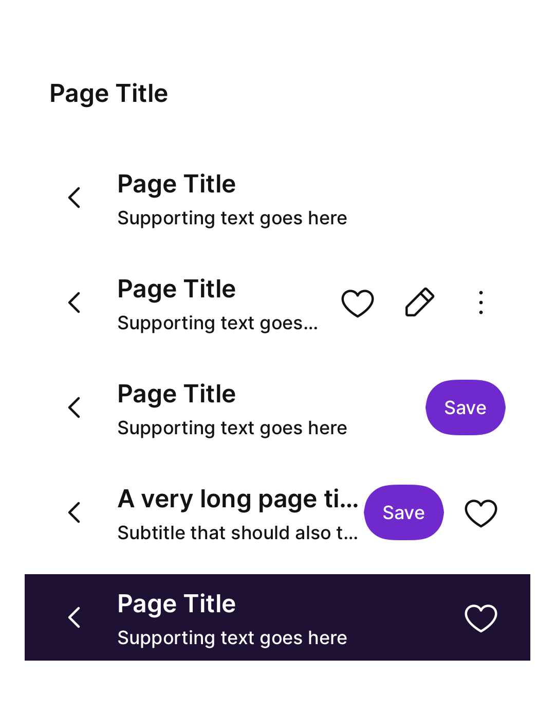
Aurum's Page Header — the canonical title-and-actions row at the top of a screen.
| family | Navigation |
|---|---|
| platform | iOS 17+ · SwiftUI |
| figma | component master ↗ |
| source | Sources/Aurum/Component/Navigation/AurumPageHeader.swift |
| code connect | FigmaConnect/Sources/AurumFigmaConnect/AurumPageHeader.figma.swift |
| snapshots | 1 baselines · iPhone 17 Pro · iOS 26.5 |
Aurum's Page Header — the canonical title-and-actions row at the top of
a screen. The SwiftUI port of aurum-android's AurumPageHeader (Figma
component set 4826:1058).
The Figma set defines exactly 10 trailing-action Type variants — each
combination of actionButton (primary button), icon1, icon2, and
isOverflow — plus two orthogonal instance properties: backButton
(the leading back icon, driven here by onBack) and subtitle. Pass
nil for any slot to omit it; the trailing slots are positionally
meaningful, so e.g. icon1: nil, icon2: x is invalid.
Layout: 56 pt bar, 16 pt horizontal padding. Left group: optional back
icon (32×40 pt wrapper, 24 pt glyph) + title/subtitle column, both
single-line with tail ellipsis. Right group: 8 pt gaps, max 140 pt wide;
the button is capped at 120 pt × 36 pt. When the bar touches the top
screen edge, containerColor bleeds under the status bar automatically
(Android's applyStatusBarInsets with no parameter).
Intended use
Use at the top of every full-screen surface in the app. The 10 Figma Type variants cover every combination of trailing controls (primary button, 1 / 2 icons, overflow) — pick the variant that matches the screen's needs. Don't introduce a custom header; this is the canonical Page Header.
Do
- Provide an explicit
accessibilityLabelfor everyAurumPageHeaderActionicon — a trailing glyph withnilfails accessibility audits. - Reserve the
primaryButtonslot for a single high-emphasis screen action (e.g. "Save", "Skip"); use icons + overflow for everything else. - Keep titles to one line; Aurum truncates with ellipsis at the design max width — long titles should be condensed at copy review, not at render time.
- Override
backIconwhere the platform convention differs from page-back navigation — e.g.AurumIcons.Navigation.closeon a modal-style screen. - Set
colorScheme: .onDark(withcontainerColor: .clear) only when the header sits on a dark hero backdrop.
Don’t
- Roll a custom navigation bar and tint it with Aurum colours — this component exists to prevent that anti-pattern.
- Hand-roll Figma's other header variants (centred title, large header) until they're added to this component.
- Stack multiple
AurumPageHeaders on one screen — one per screen.
Snapshots
Recorded on the pinned simulator — iPhone 17 Pro · iOS 26.5 · Xcode 26.6.
Code Connect
Mapped to Figma node 4826:1058 ↗ — SwiftUI snippets appear in Dev Mode for the latest release.