AurumNavBar
Aurum's bottom navigation bar — the canonical "NavBar" from the Figma design system (component set 5575:14226).
| family | Navigation |
|---|---|
| platform | iOS 17+ · SwiftUI |
| figma | component master ↗ |
| source | Sources/Aurum/Component/Navigation/AurumNavBar.swift |
| code connect | FigmaConnect/Sources/AurumFigmaConnect/AurumNavBar.figma.swift |
| snapshots | 1 baselines · iPhone 17 Pro · iOS 26.5 |
Aurum's bottom navigation bar — the canonical "NavBar" from the Figma
design system (component set 5575:14226). The SwiftUI port of
aurum-android's AurumNavBar.
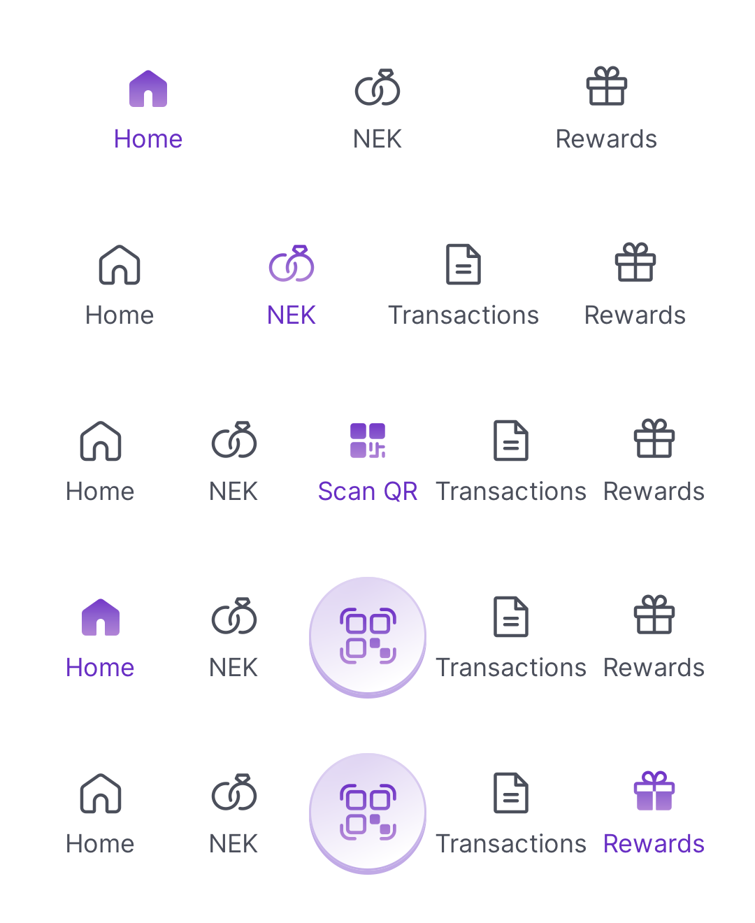
Four layout variants: 3/4/5 evenly-spaced cells, or 4 cells flanking
a raised circular Scan-QR button. Each cell renders a 24 pt icon (line
unselected, filled selected) plus a label; selected cells tint the icon
with the purple/500 → pink/50 brand ramp and the label with
textBrandNormal.
Minimum container width: 360 pt. The design assumes a 360 pt
baseline; below it, long labels ("Transactions") clip at the cell edge
— matching Figma's overflow-clip — rather than reflowing.
Intended use
Use as the persistent bottom navigation primitive on top-level screens. Pick the layout variant that matches the destination count: 3 / 4 / 5 cells, or 4 cells flanking a centre Scan-QR action. Don't roll a custom bottom bar — this is the canonical surface.
Do
- Pass paired line/filled
AurumIcons.*variants per item so the selected-state contrast reads correctly (e.g.AurumIcons.User.home+.homeFilled). - Hoist
selectedIndexin your screen state and routeonSelectthrough your navigation coordinator so the bar stays in sync with stack changes. - Match the layout to your top-level destination count — never partially-fill a 5-cell bar.
Don’t
- Wrap a
TabView's system bar and tint it with Aurum colours — this component exists to prevent that anti-pattern. - Push more than 5 items into a layout — bottom-nav UX caps at 5; restructure with sub-tabs or an overflow surface.
- Render two
AurumNavBars on one screen — one per screen, anchored to the bottom inset.
Snapshots
Recorded on the pinned simulator — iPhone 17 Pro · iOS 26.5 · Xcode 26.6.
Code Connect
Mapped to Figma node 5575:14226 ↗ — SwiftUI snippets appear in Dev Mode for the latest release.