AurumIcon
Aurum's icon primitive — the SwiftUI port of aurum-android's AurumIcon.
| family | Icons |
|---|---|
| platform | iOS 17+ · SwiftUI |
| source | Sources/Aurum/Component/Icon/AurumIcon.swift |
| snapshots | 3 baselines · iPhone 17 Pro · iOS 26.5 |
Aurum's icon primitive — the SwiftUI port of aurum-android's AurumIcon.
Renders an AurumIcons.* asset at a configurable size (defaults to
Aurum.iconSize.xl = 24 pt, the canonical icon size in the Figma icon
library) with a tint. Assets are template-rendered, so the tint paints
the glyph's alpha mask — solid colours and gradients alike.
### Tint resolution order (mirrors Android's LocalContentColor.takeOrElse)
1. Explicit tint: parameter.
2. Ambient \.aurumContentColor — set by surfaces like AurumButton
for their leading/trailing slots.
3. Aurum.colors.surface.iconDefaultNormal.
Intended use
Use to render any AurumIcons.* asset with Aurum-token tinting. The 24 pt default matches Figma's canonical icon size; pass Aurum.iconSize.* tokens for other scales. For decorative inline glyphs inside text, prefer SwiftUI Text interpolation of the asset's image.
Do
- Provide a meaningful
accessibilityLabelwhenever the icon conveys information not already present in nearby text — VoiceOver depends on it. - Use
Aurum.colors.surface.icon*tokens fortint— they pair correctly with the surrounding background contrast. - Pick the
sizefromAurum.iconSize.*(xs / sm / md / lg / xl / xxl); arbitrary point values break the visual rhythm.
Don’t
- Use raw asset names or
Image(_:bundle:)directly —AurumIcons.*is the canonical entry point and round-trips with the icon catalog. - Tint with raw
Color(...)literals; recolour throughAurum.colors.*so visual variants flow. - Use SF Symbols in feature code where a catalog icon exists — the Figma frame is the icon source of truth.
Snapshots
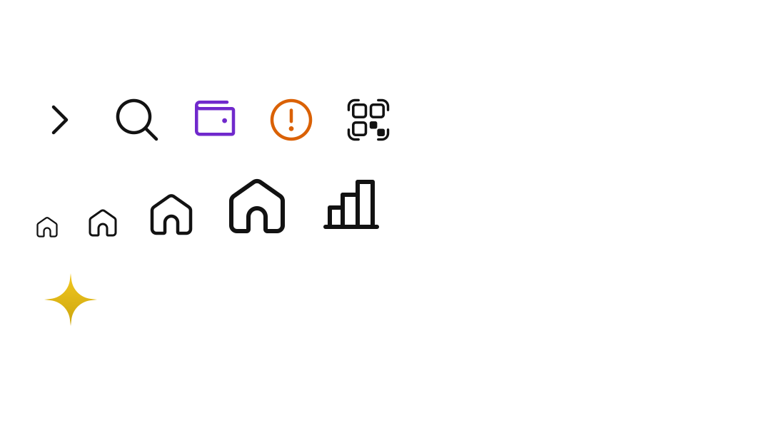
Recorded on the pinned simulator — iPhone 17 Pro · iOS 26.5 · Xcode 26.6.