AurumTextField
Aurum's primary text-input field — the SwiftUI port of aurum-android's AurumTextField.
| family | Fields |
|---|---|
| platform | iOS 17+ · SwiftUI |
| figma | component master ↗ |
| source | Sources/Aurum/Component/Field/AurumTextField.swift |
| code connect | FigmaConnect/Sources/AurumFigmaConnect/AurumTextField.figma.swift |
| snapshots | 1 baselines · iPhone 17 Pro · iOS 26.5 |
Aurum's primary text-input field — the SwiftUI port of aurum-android's
AurumTextField.
Anatomy per Figma: an optional static label rendered above the
field (it never floats into the outline — Aurum deliberately opts out of
the Material floating-label behaviour), the outlined input box, and an
optional helper / error / success message below. The placeholder sits
inside the box whenever the value is empty and disappears as the user
types.
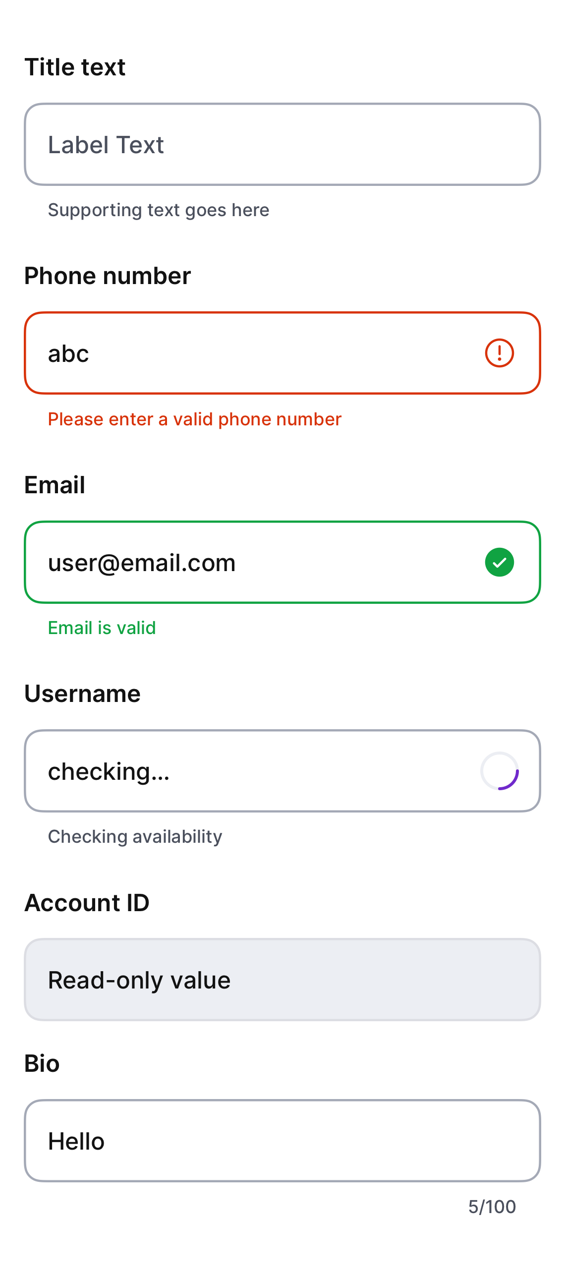
When errorText is non-nil the field enters the error state
automatically; successText (with no error) enters the success state.
Error / success / loading states show their trailing status affordance
automatically unless the caller supplies a trailing slot. A character
counter appears in the support row when maxLength is set; input beyond
it is truncated.
Platform notes vs Android: SwiftUI homes the caret at the end of
programmatically-set values natively (no TextFieldValue dance needed);
readOnly renders the display-only style and blocks editing via
.disabled (SwiftUI has no focusable-but-not-editable mode);
isSecure: true replaces Android's PasswordVisualTransformation.
Intended use
Use for free-text capture on form surfaces — name, address, notes, message body, anything that maps cleanly to a string. For specialised inputs reach for the dedicated component: AurumSearchField for in-screen search boxes (phone / amount / OTP inputs arrive with their ports).
Do
- Pair
errorTextwith a clear validation message — never silently mark fields wrong. - Set
maxLengthfor any field with backend-enforced length limits — the counter gives users instant feedback. - Use
keyboardType:to surface the right keyboard for the data shape (numeric, email, URL).
Don’t
- Use this for OTP entry — the dedicated OTP input handles paste, autofill, and resend-timer UX correctly.
- Style raw
TextFields with tokens in feature code — this component owns the field anatomy. - Override colours with raw values; recolour through validation state (
errorText/successText).
Snapshots
Recorded on the pinned simulator — iPhone 17 Pro · iOS 26.5 · Xcode 26.6.
Code Connect
Mapped to Figma node 4623:373 ↗ — SwiftUI snippets appear in Dev Mode for the latest release.