AurumToast
Aurum's toast primitive — a non-blocking, dismissible status strip surfaced over content.
| family | Feedback |
|---|---|
| platform | iOS 17+ · SwiftUI |
| figma | component master ↗ |
| source | Sources/Aurum/Component/Feedback/AurumToast.swift |
| code connect | FigmaConnect/Sources/AurumFigmaConnect/AurumToast.figma.swift |
| snapshots | 1 baselines · iPhone 17 Pro · iOS 26.5 |
Aurum's toast primitive — a non-blocking, dismissible status strip
surfaced over content. The SwiftUI port of aurum-android's AurumToast;
renders Figma's toast component set (node 6014:2621).
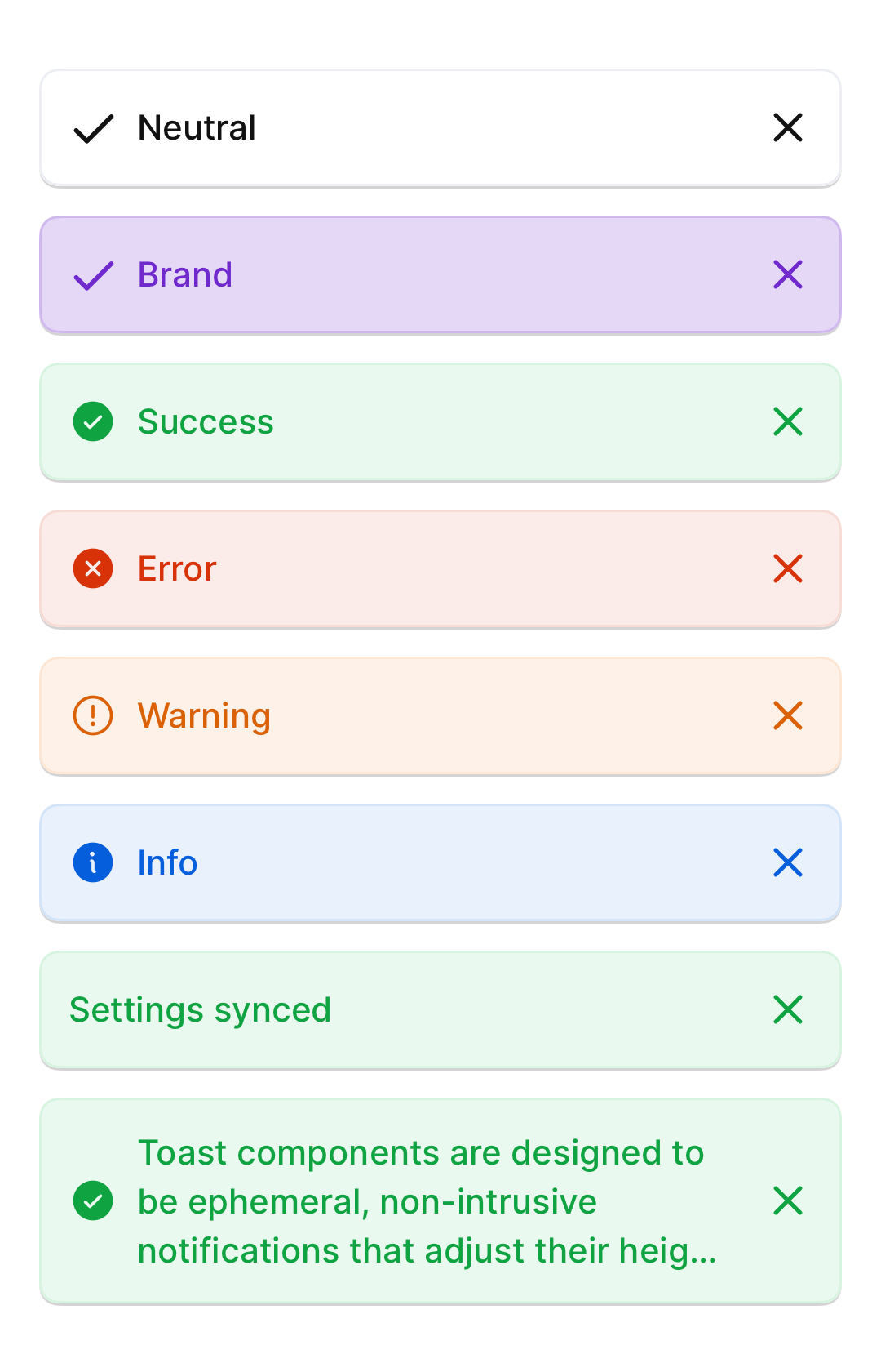
Six tone roles × two sizes = 12 visual variants. Each tone pairs a
feedback.* subtle background with the matching intense text/icon, plus
a per-tone leading status glyph. An opaque bgPageBase base is painted
under the tint so the strip reads solid over any backdrop. A trailing
close AurumIconButton is always present and fires onDismiss.
This is a presentational primitive — it does not own the show/hide
lifecycle, queue, or auto-dismiss timer. Pair it with caller-owned state
for visibility, or with AurumToastHost + AurumToastHostState.
Intended use
Use to surface lightweight, asynchronous feedback tied to a recent user action — "Saved", "Copied", "Couldn't fetch, retrying", "New version available". Pick the tone from semantic intent: success for confirmations, error for failures, warning for at-risk state, info for neutral context, brand for product moments, neutral for system feedback without urgency. For modal confirmations or destructive flows use AurumBottomSheet; for inline form validation use the input components' built-in error affordances.
Do
- Pick
tonefrom semantic intent — never style a neutral toast red to "look like an error", choose.errorinstead. - Use
.smallfor confirmations that fit in 1–4 words; reach for.largeonly when the message genuinely needs to wrap. - Pair the toast with a caller-owned visibility state and auto-dismiss timer (
AurumToastHostprovides both) so it disappears without forcing the user to tap the ✕.
Don’t
- Stack two toasts of different tones — show the newer one and let it replace the prior.
- Embed buttons / link affordances inside the label — the toast is a status strip, not an action surface. If you need an action, prefer
AurumBottomSheetor a contextual CTA next to the originating control. - Use a toast as the only feedback channel for irreversible actions — surface those through a confirmation sheet so the user has a chance to react before the strip fades.
Snapshots
Recorded on the pinned simulator — iPhone 17 Pro · iOS 26.5 · Xcode 26.6.
Code Connect
Mapped to Figma node 6014:2621 ↗ — SwiftUI snippets appear in Dev Mode for the latest release.