AurumBadge
Aurum's badge primitive — a small, non-interactive label used for status, categorization, or count indicators.
| family | Feedback |
|---|---|
| platform | iOS 17+ · SwiftUI |
| figma | component master ↗ |
| source | Sources/Aurum/Component/Feedback/AurumBadge.swift |
| code connect | FigmaConnect/Sources/AurumFigmaConnect/AurumBadge.figma.swift |
| snapshots | 1 baselines · iPhone 17 Pro · iOS 26.5 |
Aurum's badge primitive — a small, non-interactive label used for
status, categorization, or count indicators. The SwiftUI port of
aurum-android's AurumBadge.
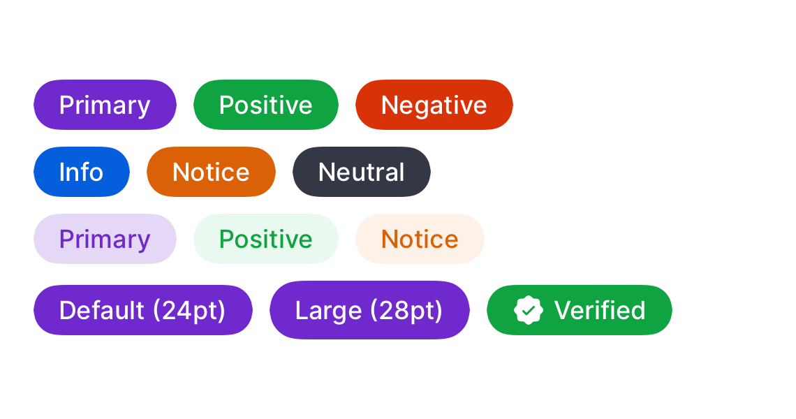
Supports 6 colour roles × 2 emphases × 2 sizes, with an optional
leading icon. Emphasis and text/icon colours follow a cross-axis
pairing by design (matching the Figma token references): intense
background → inverse content; subtle background → intense content.
Intended use
Use as a small status / categorisation / count indicator anchored to another piece of content — "New" pill on a list item, "Verified" stamp on a profile, unread count on an avatar. The intense emphasis pulls the eye; subtle is the same role at lower volume. For tappable filters use AurumChip.
Do
- Pick the
colorfrom semantic intent — positive for success, negative for failure, notice for warnings, info for neutral context. - Anchor the badge to its subject (top-right of an icon, inline before a label) so the relationship is unambiguous.
- Keep labels to 1–2 words; long text wraps awkwardly in the pill.
Don’t
- Use as a tappable affordance — badges are non-interactive. For tap actions use
AurumChip. - Stack badges vertically on a single subject; one anchored badge per item conveys status best.
- Mix multiple
colorroles on the same surface for the same kind of subject — readers infer hierarchy from the role choice.
Snapshots
Recorded on the pinned simulator — iPhone 17 Pro · iOS 26.5 · Xcode 26.6.
Code Connect
Mapped to Figma node 4240:10542 ↗ — SwiftUI snippets appear in Dev Mode for the latest release.