AurumDivider
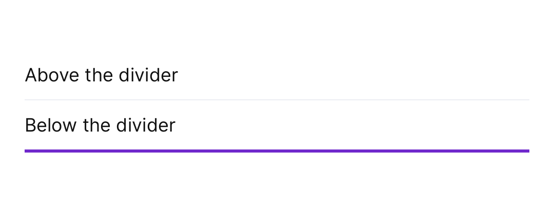
Aurum's divider primitive — a thin horizontal line used to separate content sections.
| family | Dividers |
|---|---|
| platform | iOS 17+ · SwiftUI |
| source | Sources/Aurum/Component/Divider/AurumDivider.swift |
| snapshots | 1 baselines · iPhone 17 Pro · iOS 26.5 |
Aurum's divider primitive — a thin horizontal line used to separate
content sections. The SwiftUI port of aurum-android's AurumDivider:
a styled rectangle, not SwiftUI.Divider (whose hairline colour and
thickness are system-controlled, not token-controlled).
Intended use
Use as a thin separator between rows in a list, or before/after a logical content group. Keeps the surface scannable without introducing a new section affordance. For layout spacing use Aurum.space.* tokens — a Spacer/padding is structurally cheaper than a divider.
Do
- Use the default
borderSurfaceLowContrastcolour — it's tuned to be visible without competing with content. - Reach for
Aurum.borderWidth.xs(default, hairline) — thicker dividers read as decoration rather than separation.
Don’t
- Use as decorative page-break flourish — that's a typography or layout concern, not a divider.
- Use for layout spacing — padding or a fixed-height
Spaceris the right tool when you just need air, not a visible line.
Snapshots
Recorded on the pinned simulator — iPhone 17 Pro · iOS 26.5 · Xcode 26.6.