AurumPill
Aurum's pill — a compact, label-first status / token element.
| family | Chips |
|---|---|
| platform | iOS 17+ · SwiftUI |
| figma | component master ↗ |
| source | Sources/Aurum/Component/Chip/AurumPill.swift |
| code connect | FigmaConnect/Sources/AurumFigmaConnect/AurumPill.figma.swift |
| snapshots | 1 baselines · iPhone 17 Pro · iOS 26.5 |
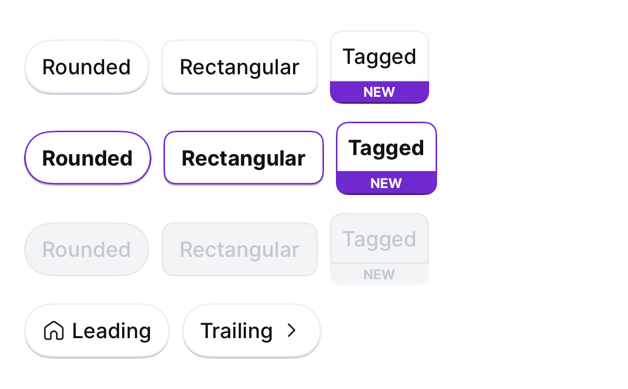
Aurum's pill — a compact, label-first status / token element. The SwiftUI
port of aurum-android's AurumPill, rendering Figma's Pills component set
(file YvIxqu2oTlM6UnkL0OloHc, node 5891-802) across its three types
and three states (default / selected → Figma "focus" / disabled), with
optional leading or trailing icons.
A pill is quieter than AurumChip: a chip is an action / filter CTA; a pill
is a status, category, or selectable token.
Intended use
A small label-first token for status, category, or a selectable filter where a full AurumChip would shout. Short labels (1–2 words). For primary actions use AurumButton; for an action / filter CTA use AurumChip.
Do
- Use
.roundedby default; reserve.rectangularfor grid/table cells where square-ish corners read better. - Drive the active look with
selected, not by recolouring. - Use
.withTagswithtagfor a pill that carries a small category/discount ribbon.
Don’t
- Recolour the container — the state set is fixed; use
selected/enabled. - Use a pill as a primary action — switch to
AurumButton. - Pass icons on
.withTags— that type is label + tag only.
Snapshots
Recorded on the pinned simulator — iPhone 17 Pro · iOS 26.5 · Xcode 26.6.
Code Connect
Mapped to Figma node 5891:802 ↗ — SwiftUI snippets appear in Dev Mode for the latest release.