AurumChip
Aurum's chip — a pill-shaped tappable element.
| family | Chips |
|---|---|
| platform | iOS 17+ · SwiftUI |
| figma | component master ↗ |
| source | Sources/Aurum/Component/Chip/AurumChip.swift |
| code connect | FigmaConnect/Sources/AurumFigmaConnect/AurumChip.figma.swift |
| snapshots | 1 baselines · iPhone 17 Pro · iOS 26.5 |
Aurum's chip — a pill-shaped tappable element. The SwiftUI port of
aurum-android's AurumChip, rendering Figma's chip component set across
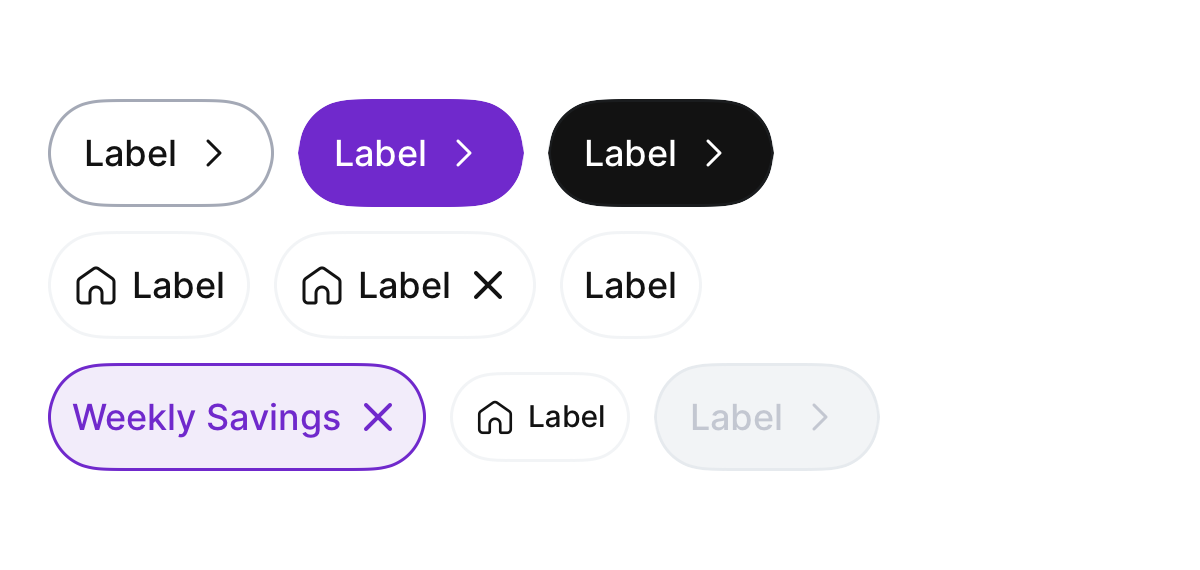
both action and other types. Slot composition picks the Figma chip
role within other:
- label only — Suggestion
- leadingIcon + label — Assist
- leadingIcon + label + trailingIcon — Filter / Input
action is the canonical label + trailing chevron CTA chip and carries
the brand / black colour variants.
Intended use
Single tappable category/filter selector or a brand action surface in dense layouts. Short labels (1–2 words). Prefer AurumButton for primary actions.
Do
- Pair
leadingIconwith monosemic glyphs (filter, sort, history). - Use
.smallin dense rows;.largefor one-off CTAs in section headers. - Reserve
.brandfor the primary CTA on a surface (≤1 per screen).
Don’t
- Use chips as form input — exclusive choices belong to selection controls.
- Override colours via
.background/ explicit tints; recolour throughvariantonly. - Stack vertically — chips flow horizontally with
s2spacing.
Snapshots
Recorded on the pinned simulator — iPhone 17 Pro · iOS 26.5 · Xcode 26.6.
Code Connect
Mapped to Figma node 4446:701 ↗ — SwiftUI snippets appear in Dev Mode for the latest release.