AurumLinkButton
Aurum's link button — a text-only button with no background or border.
| family | Buttons |
|---|---|
| platform | iOS 17+ · SwiftUI |
| figma | component master ↗ |
| source | Sources/Aurum/Component/Button/AurumLinkButton.swift |
| code connect | FigmaConnect/Sources/AurumFigmaConnect/AurumLinkButton.figma.swift |
| snapshots | 1 baselines · iPhone 17 Pro · iOS 26.5 |
Aurum's link button — a text-only button with no background or border.
The SwiftUI port of aurum-android's AurumLinkButton.
Per the Figma spec this is a separate component from AurumButton:
brand-purple text with no fill or outline, 40 pt tall at both sizes.
Pressed dims the label to the subtle brand colour (Android's pressed
state); there is no other press feedback, matching Android's
indication = null.
Intended use
Use for low-emphasis inline actions next to body copy ("Skip", "Read more", "Resend OTP", "Forgot password?"). The lack of fill / outline makes it read as text — not as a CTA — so users feel free to ignore it. For deliberate commitment actions (submit, confirm, continue) reach for AurumButton.
Do
- Pair with longer prose context — "Already have an account? Sign in" reads naturally; a bare standalone link button looks orphaned.
- Reserve for navigational + secondary actions — "Forgot password?", "Resend code", "Learn more".
- Place inline with the surrounding paragraph copy at the same baseline; don't right-align it as a fake CTA.
Don’t
- Use as the form-submit button — that's
AurumButtonwith.primary; users won't perceive the link as a commitment. - Stack two link buttons in the same row — they read as a list of links, losing the "single low-emphasis action" intent.
- Render destructive actions (Delete, Cancel subscription) here — destructive flows need
AurumButtonwith explicit confirmation, not text-styled affordances.
Snapshots
Recorded on the pinned simulator — iPhone 17 Pro · iOS 26.5 · Xcode 26.6.
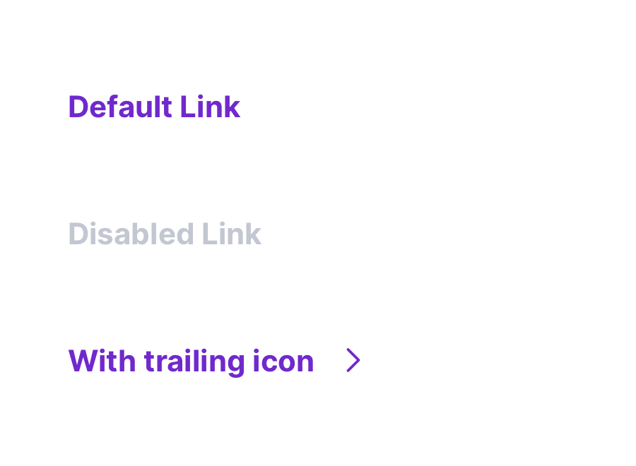
Code Connect
Mapped to Figma node 4784:1286 ↗ — SwiftUI snippets appear in Dev Mode for the latest release.