AurumButton
Aurum's primary button component — the SwiftUI port of aurum-android's AurumButton.
| family | Buttons |
|---|---|
| platform | iOS 17+ · SwiftUI |
| figma | component master ↗ |
| source | Sources/Aurum/Component/Button/AurumButton.swift |
| code connect | FigmaConnect/Sources/AurumFigmaConnect/AurumButton.figma.swift |
| snapshots | 6 baselines · iPhone 17 Pro · iOS 26.5 |
Aurum's primary button component — the SwiftUI port of aurum-android's
AurumButton.
A custom primitive (Button + a private ButtonStyle for
configuration.isPressed) — not a restyled system button — so every
state matches the Figma component exactly and bespoke interactions
(the dimensional hard-shadow press) are unconstrained. Features consume
this view for any button.
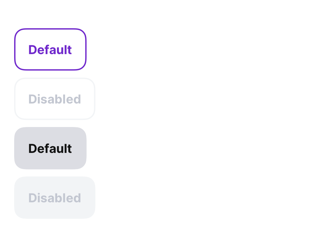
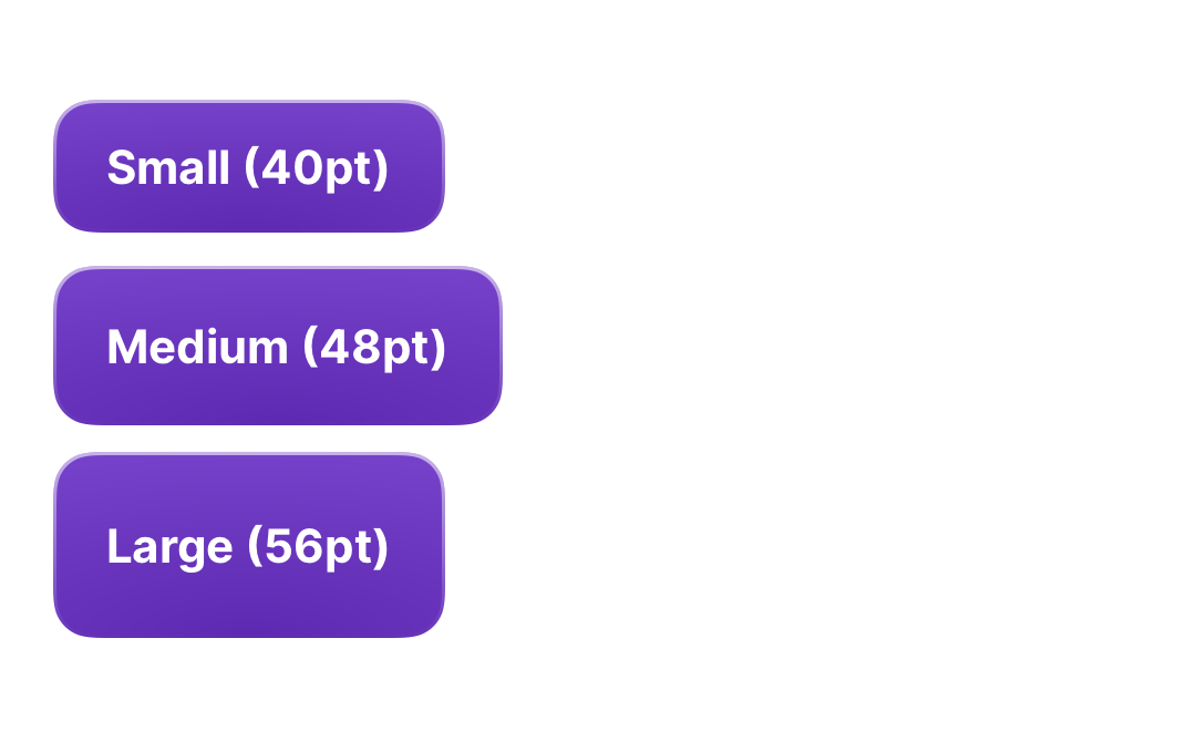
Three visual variant variants (AurumButtonVariant) and three size
variants (AurumButtonSize) are supported. Optional leading and
trailing slots accept icon views for icon-and-label buttons; slot
content picks up the button's foreground via \.aurumContentColor.
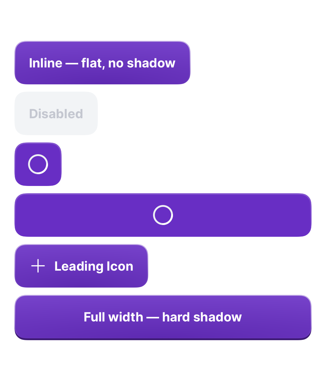
Platform notes vs Android: the ripple's place is taken by a 12% content-colour press overlay (except the dimensional full-width primary, whose press cue is purely the shadow drop + 2 pt sink); the minimum touch target reserves 44 pt (HIG) rather than Android's 48 dp.
Intended use
Use when the user is performing a deliberate, named action (submit, confirm, continue, retry). One .primary per surface — pair Primary with Secondary or Tertiary for additional actions.
Do
- Use one
.primaryper screen for the dominant CTA. - Choose
.mediumas the default;.largeonly for full-width hero CTAs;.smallfor inline / compact rows. - Set
isLoading: truesynchronously when the action starts a network round-trip — don't render a separate spinner alongside. - Drive
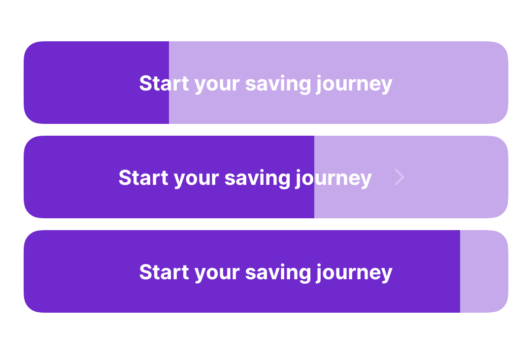
progressfrom a countdown for an auto-advancing CTA — the fill mirrors the time left before the action fires on its own.
Don’t
- Stack two
.primarybuttons next to each other — pair Primary with Secondary. - Use a button to navigate without a side-effect; use a plain tap target instead.
- Apply
.frame(maxWidth: .infinity)yourself — useisFullWidth: trueso the Aurum padding / touch-target rules apply.
Snapshots
Recorded on the pinned simulator — iPhone 17 Pro · iOS 26.5 · Xcode 26.6.

Code Connect
Mapped to Figma node 4692:1074 ↗ — SwiftUI snippets appear in Dev Mode for the latest release.